Mamacita
- Author(s)Yoann Sirvin
- Year2023
- MissionBrand strategy, Brand visual identity, Creative direction, Print design
- Client/
- StatusCompleted
- AreasFood & beverage
See more
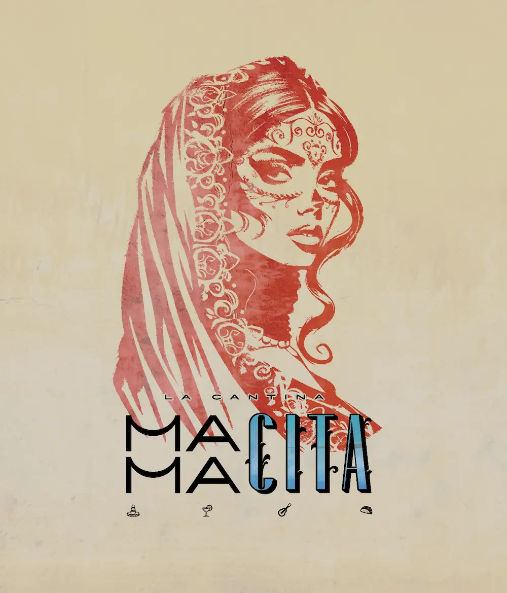
Mamacita
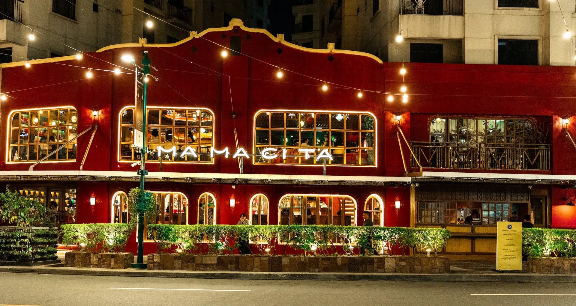
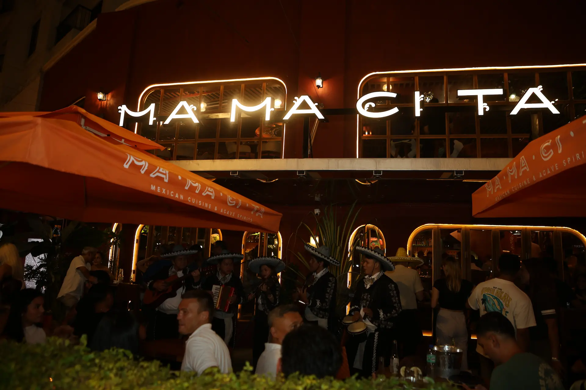
Blending authentic Mexican culture with Manila’s vibrant energy
The creation of the Mamacita brand began with defining a strong and authentic identity that reflects both the richness of Mexican culture and the vibrant energy of Manila. The goal was to create a brand that feels warm, lively, and welcoming—just like a traditional Mexican home.
1. Concept Development
The name Mamacita was chosen to evoke familiarity, affection, and cultural depth. It suggests homemade flavors, tradition, and a personal touch. The concept blends Mexican heritage with a modern, urban Manila lifestyle, appealing to both locals and international customers.
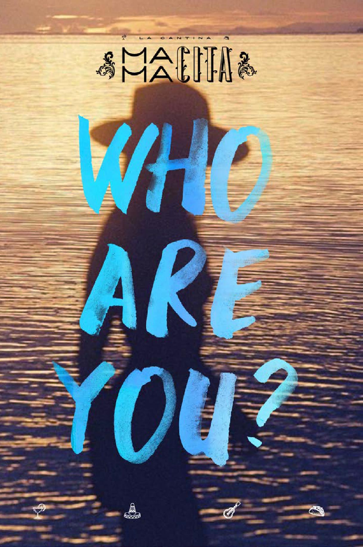
2. Brand Identity & Storytelling
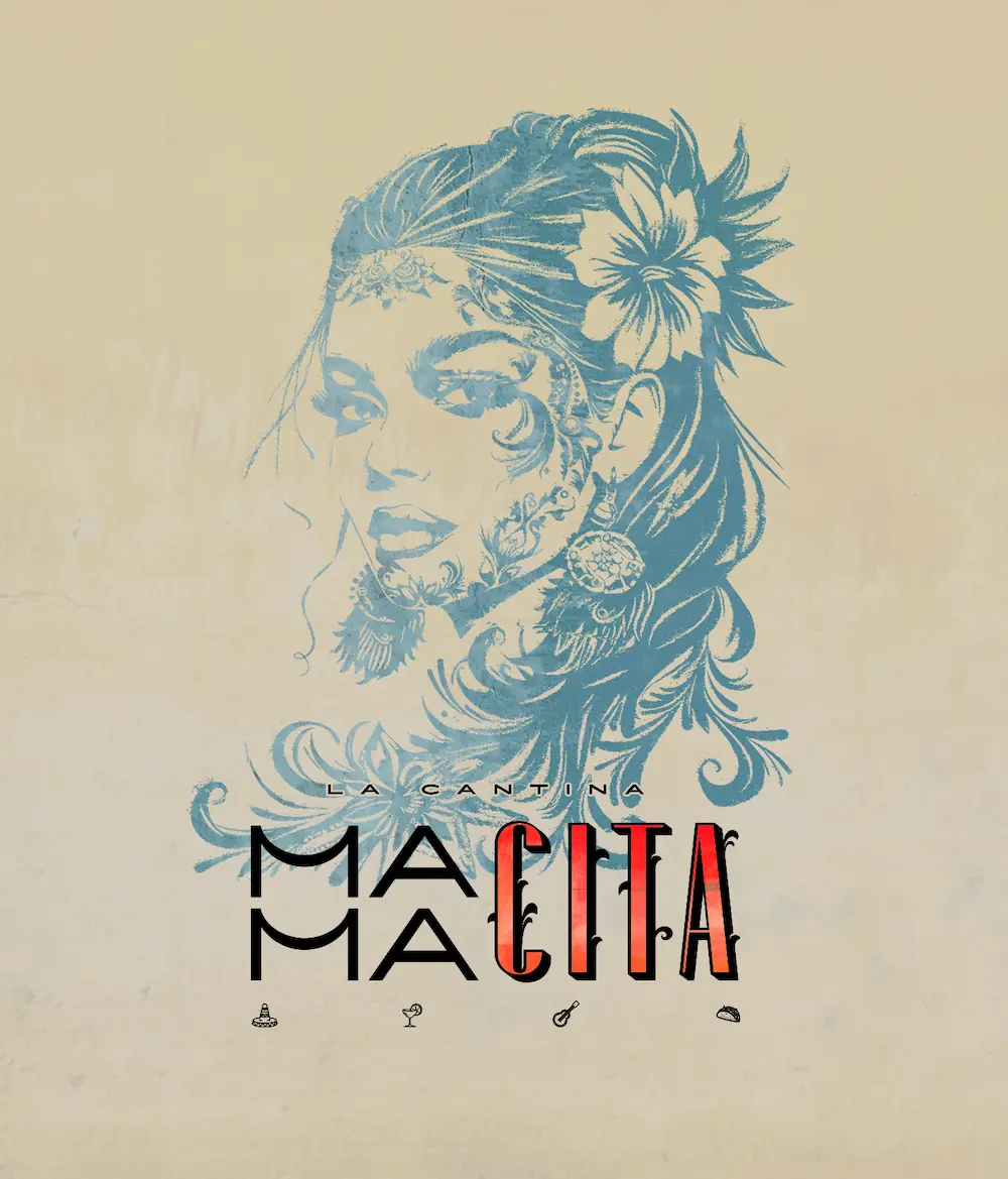
The brand story centers around the idea of “home-style Mexican cooking with a soulful twist.” Mamacita is portrayed as a symbolic figure—a strong, caring woman who brings people together through food. This narrative helps build emotional connection and authenticity.
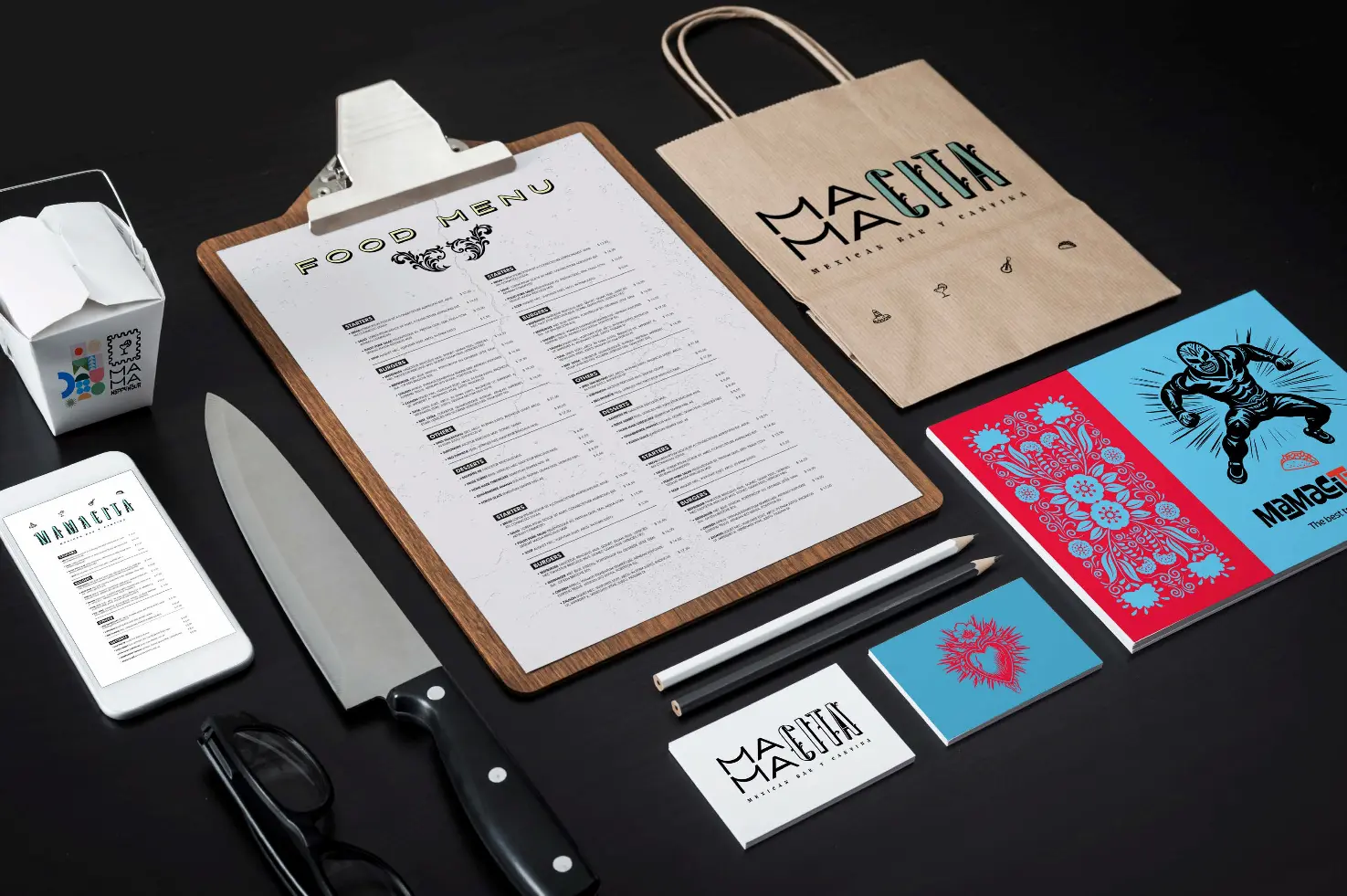
3. Visual Identity
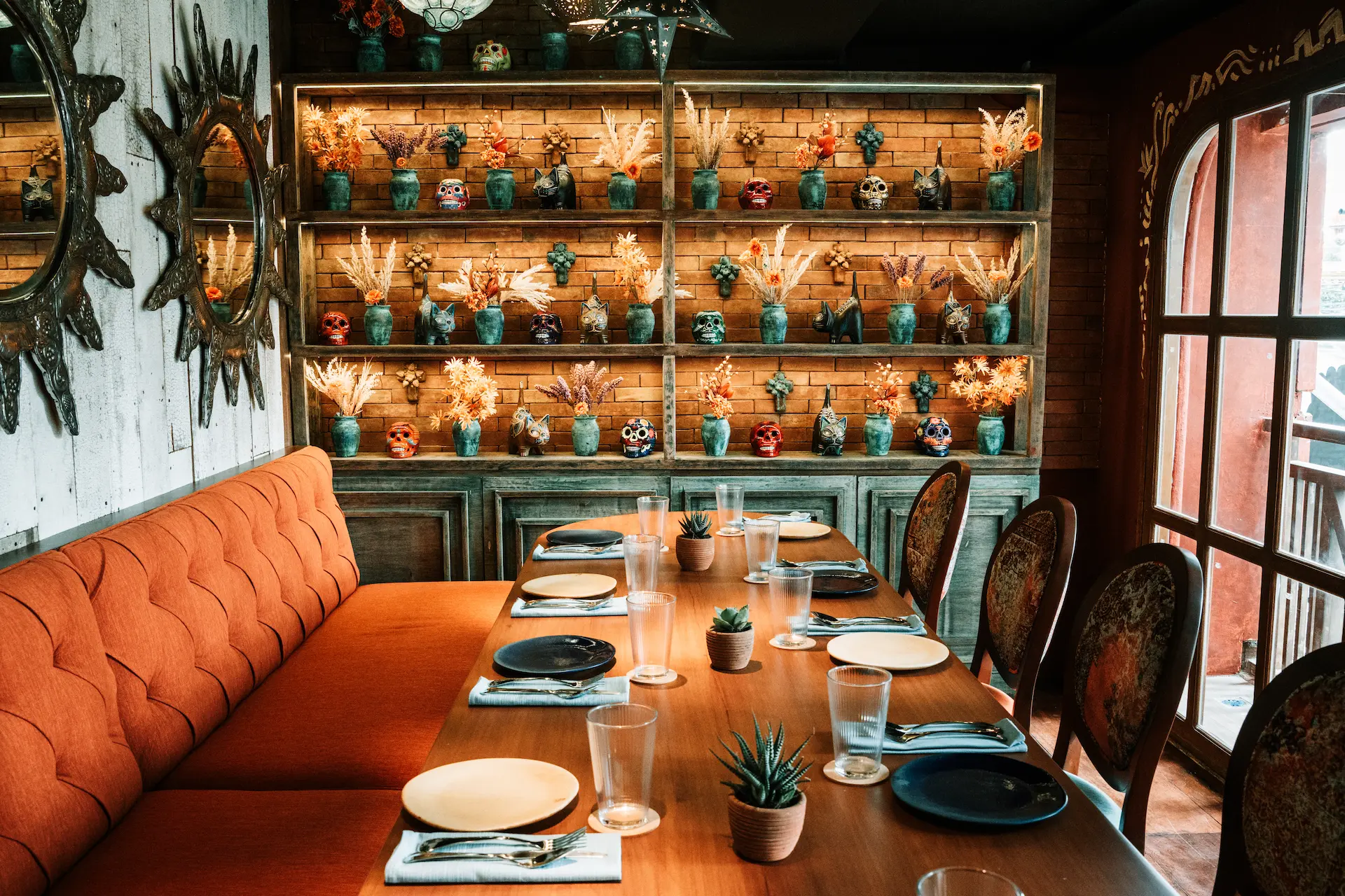
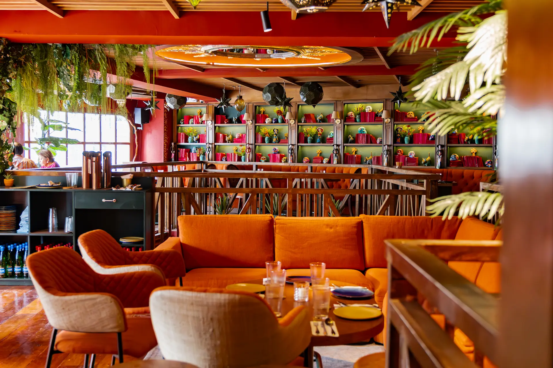
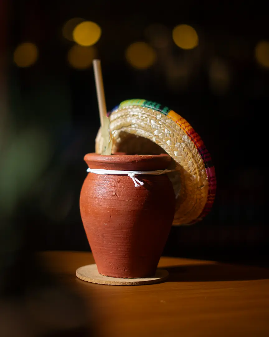
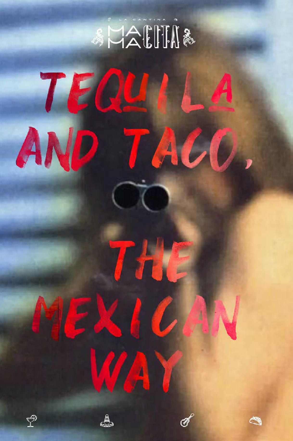
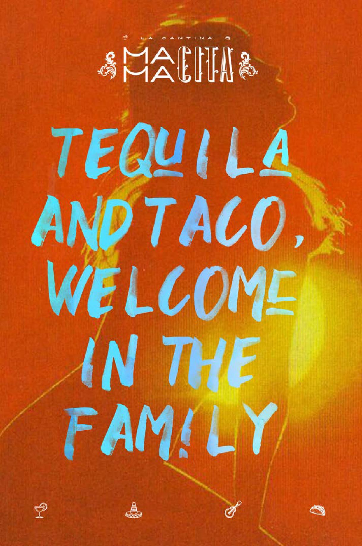
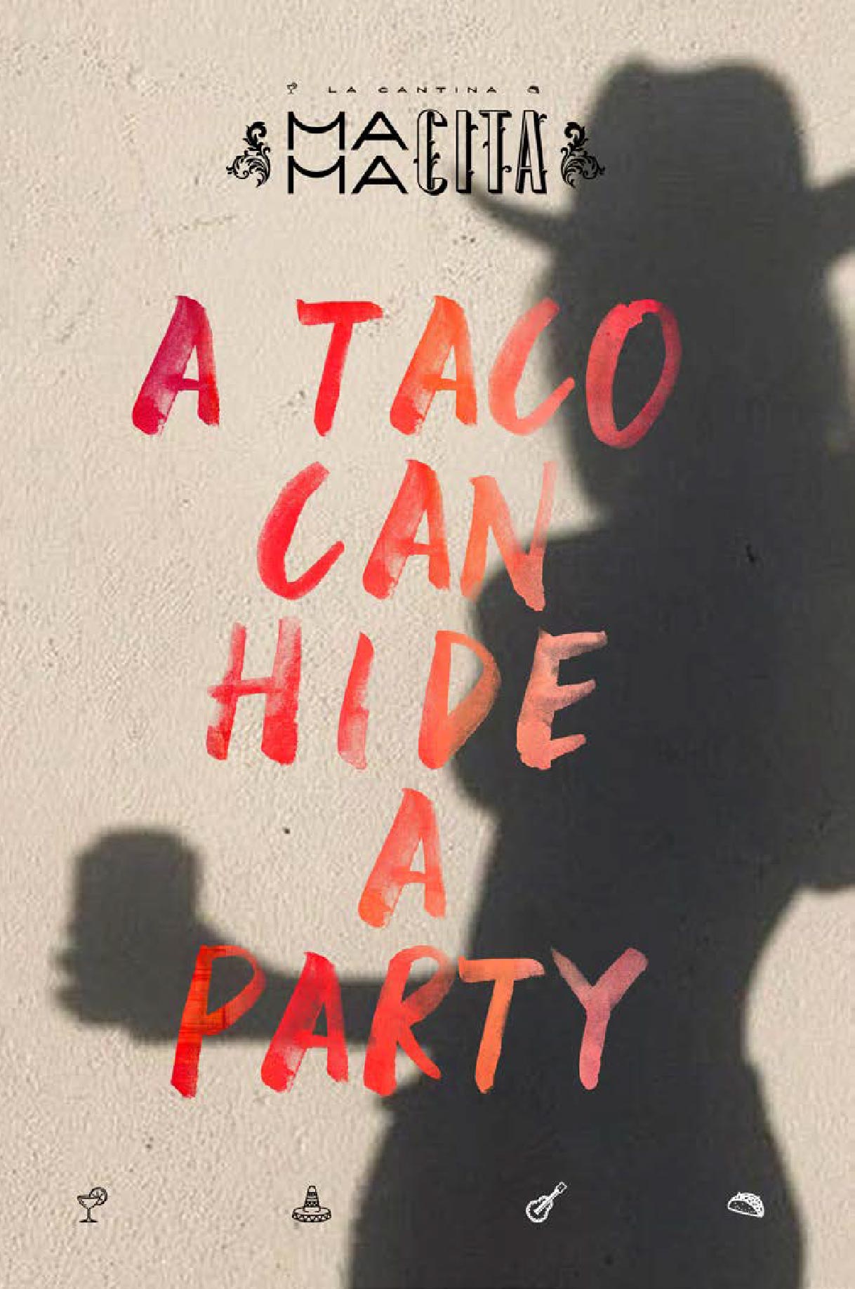
The visual elements draw inspiration from Mexican art and colors:
- A vibrant color palette (terracotta, chili red, turquoise, and warm yellow)
- Typography that reflects handcrafted, festive aesthetics
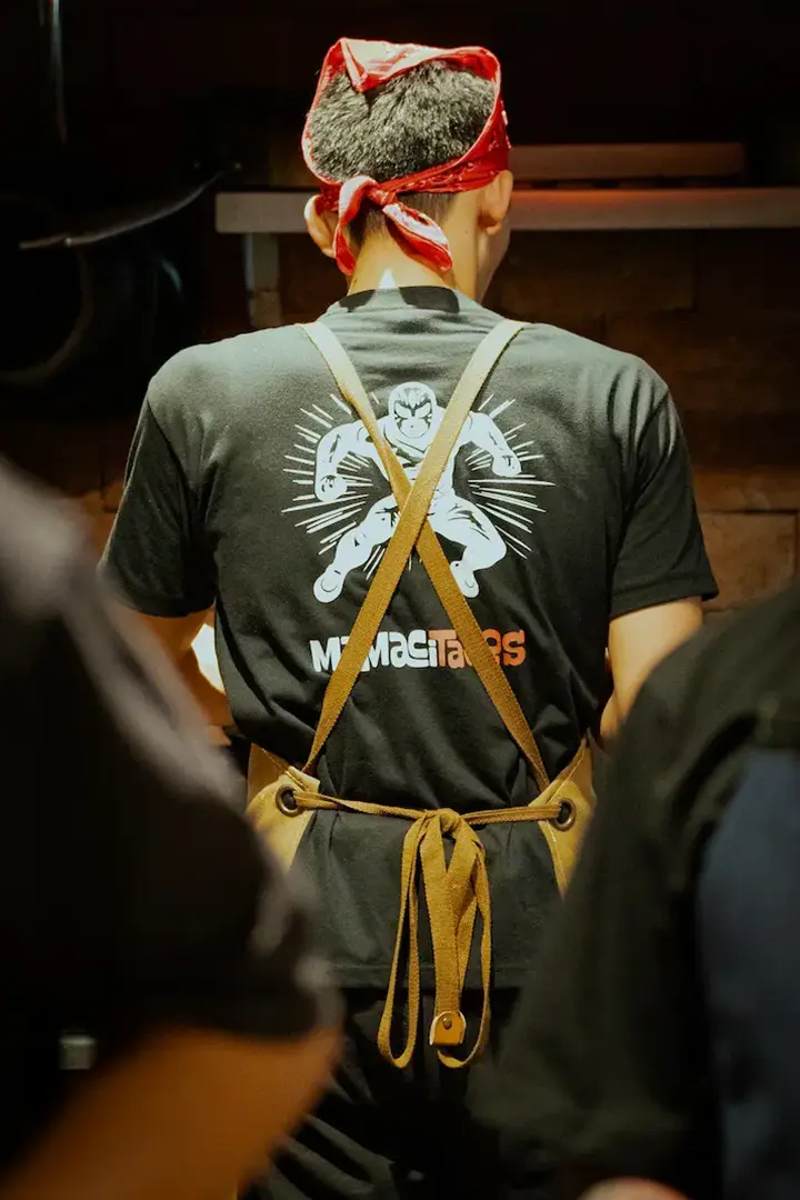
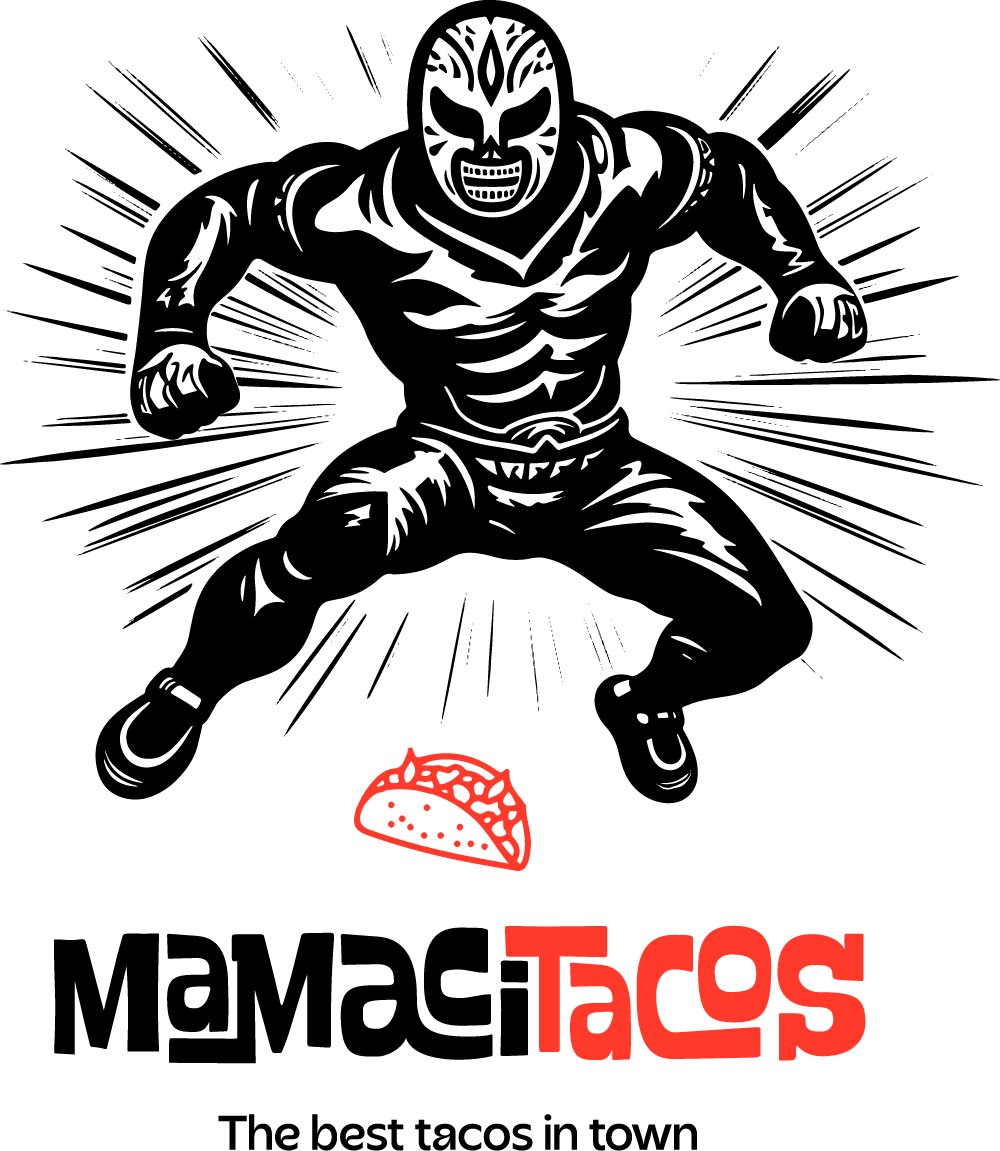
- Graphic elements inspired by traditional patterns, folk art, and street culture
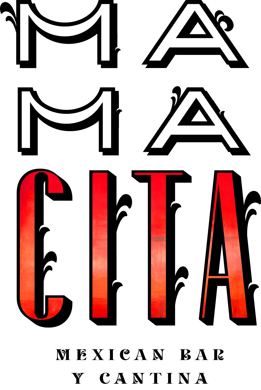
- The logo is designed to be bold, memorable, and expressive of the restaurant’s personality.
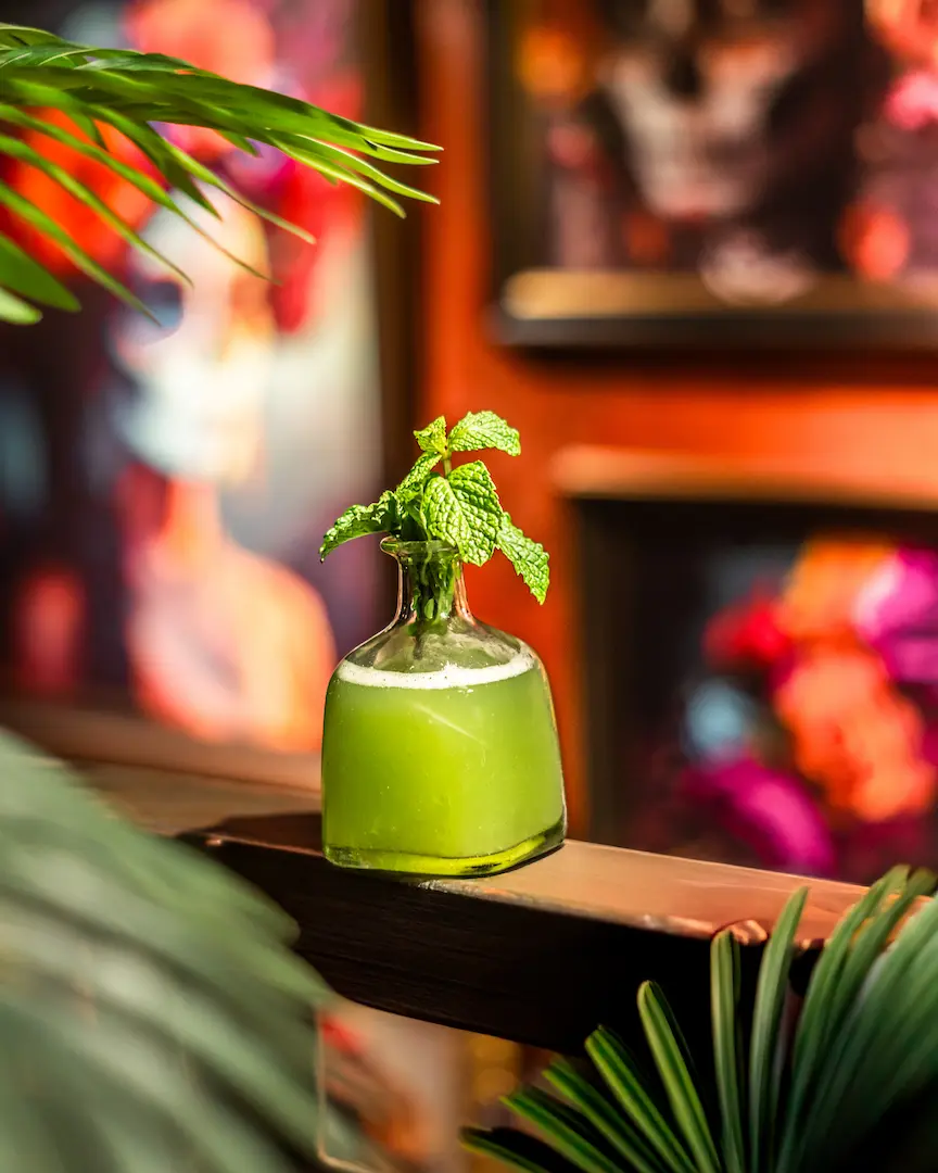
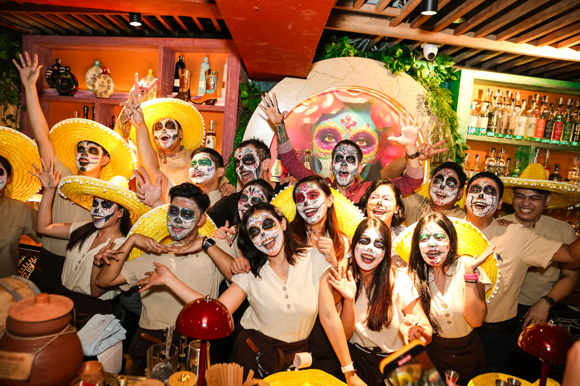
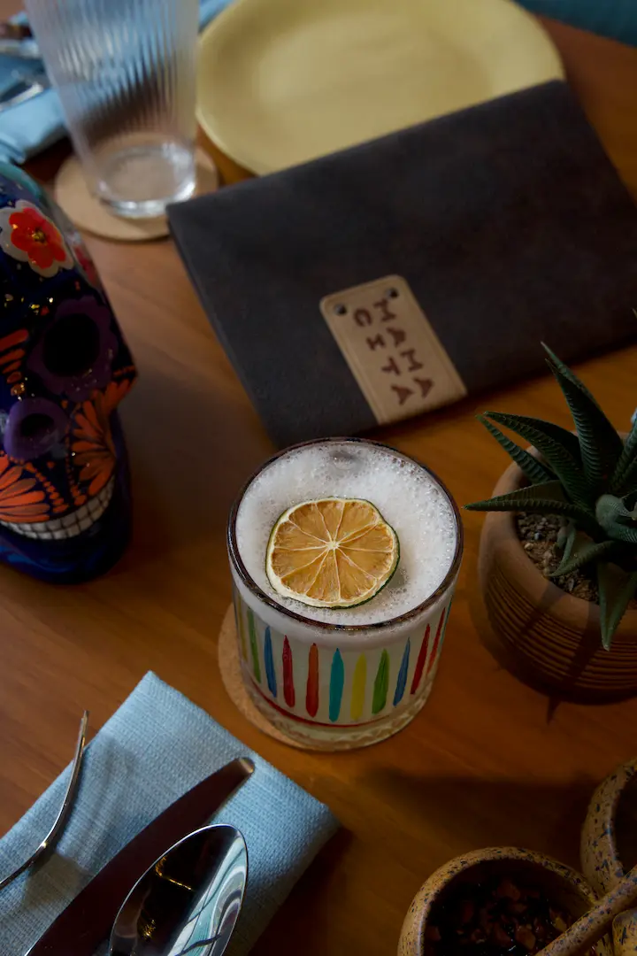
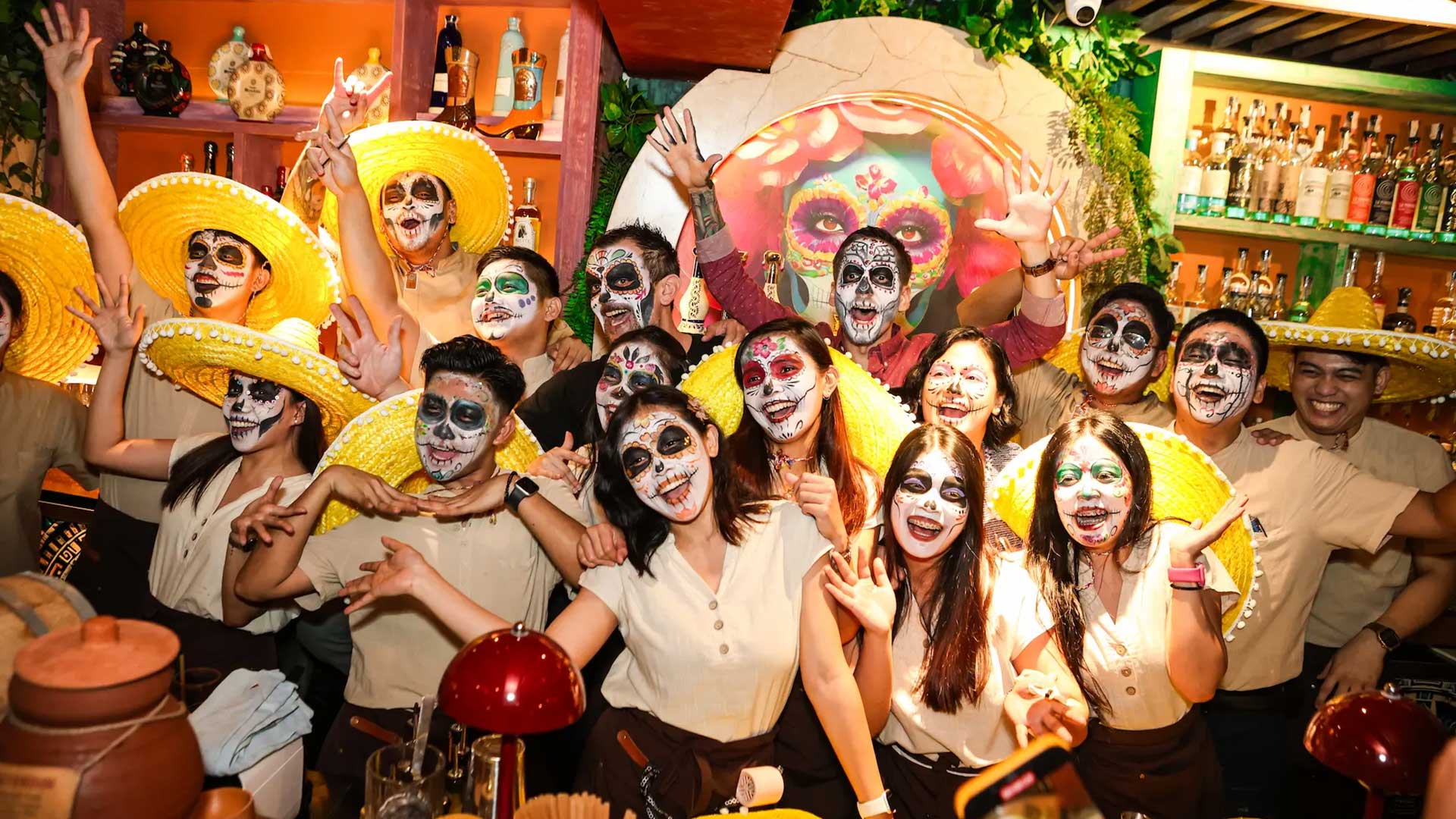
4. Interior & Experience Design
The physical space reflects the brand through colorful décor, textured materials, and lively music. The atmosphere combines Mexican warmth with Manila’s dynamic dining culture, creating an immersive experience that feels both exotic and familiar.
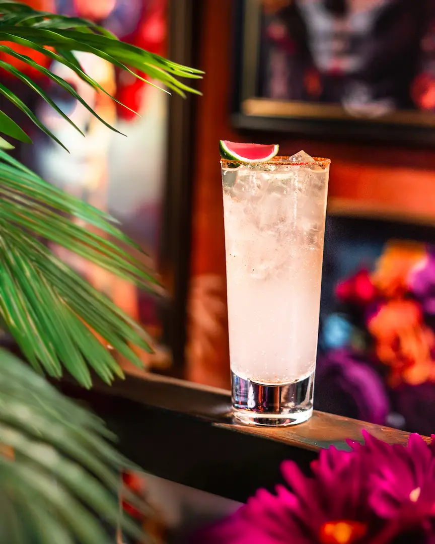
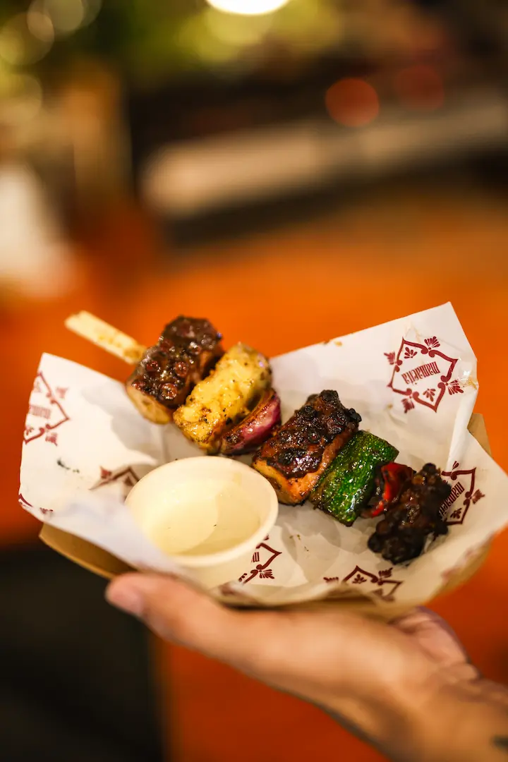
5. Menu & Culinary Positioning
The menu highlights authentic Mexican dishes while adapting certain flavors to local preferences. Presentation, naming, and descriptions are aligned with the brand voice—playful, bold, and inviting.
6. Tone of Voice & Communication
Mamacita’s voice is friendly, confident, and slightly playful. It uses casual, engaging language that reflects warmth and personality across social media, advertising, and in-store messaging.
7. Market Positioning
The brand is positioned as a trendy yet approachable Mexican dining destination in Manila—perfect for casual gatherings, social dining, and cultural discovery.
Overall, the Mamacita brand is designed to deliver more than just food—it offers a cultural experience that connects people through flavor, atmosphere, and storytelling.